The challenge
The loan experience was mostly the same across countries.
But in Figma — it wasn’t. Designs were scattered, flows weren’t connected, and there was no shared system


(was the figma chaos)
and...
I decided to fix it

New version
/ Every state, screen, and variation is built as a component — connected to logic and user actions
What I did
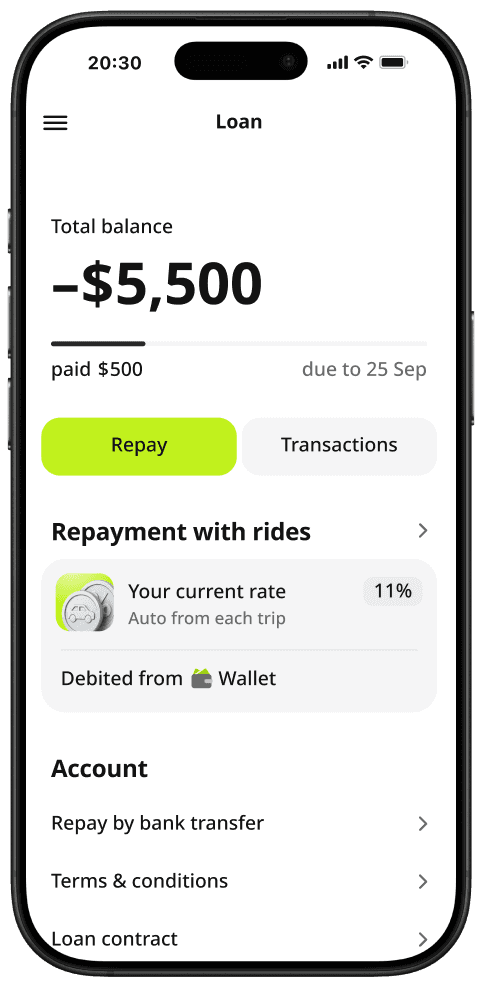
I brought everything into one page — with components, flows, and clear logic behind each block. Now every region starts from the same structure. Developers pick what they need, adapt the text, and launch faster — with full control and no guesswork
A single loan page with shared logic, reusable blocks, and clearly defined flows


Each flow is designed, documented, and ready to use
Each flow is designed, documented, and ready to use
Ready to ship
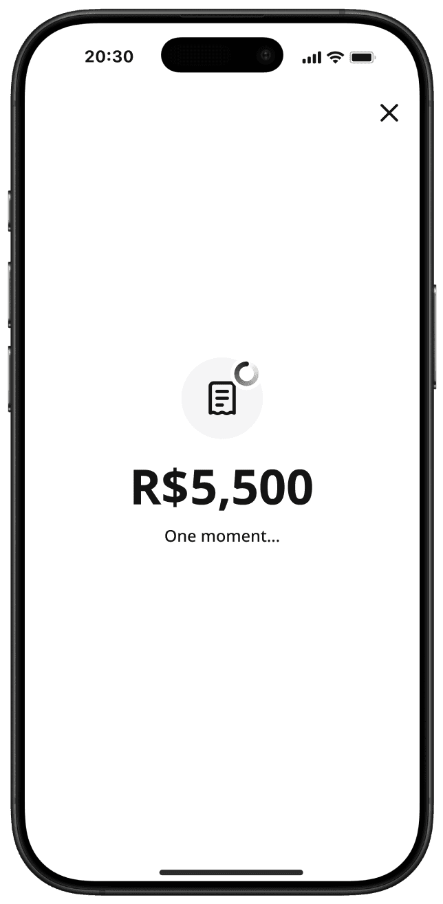
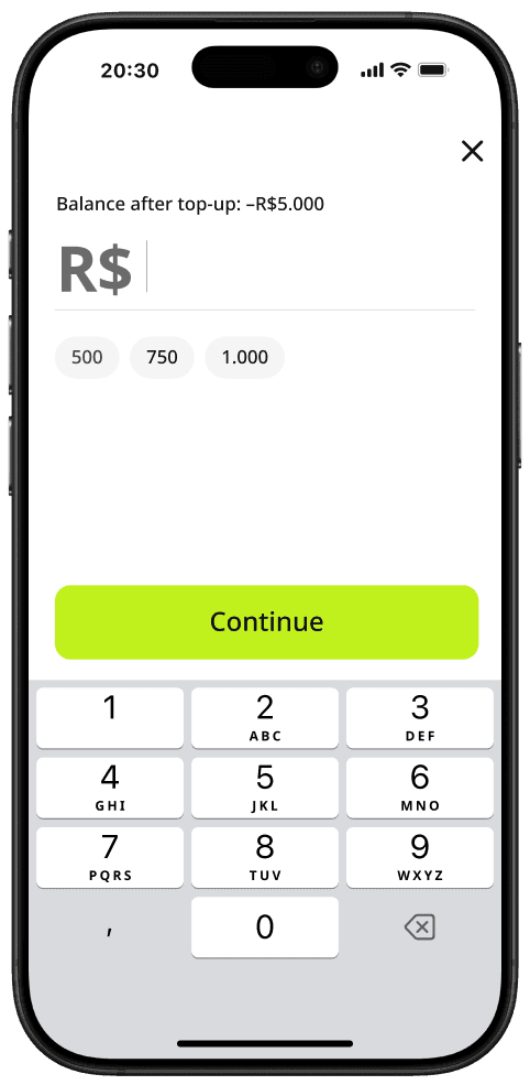
/ Every top-up type is fully designed — from entry to confirmation.
/ Edge cases, button states, empty screens, success messages — all covered
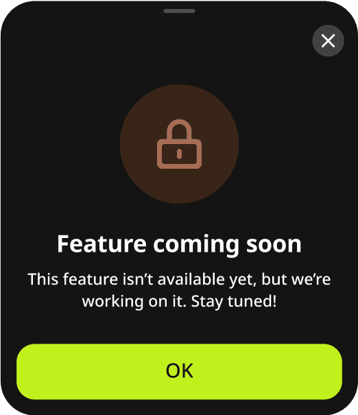
Teams just select the flow that fits
/ If something custom is needed, it’s clear what to change — and what to keep
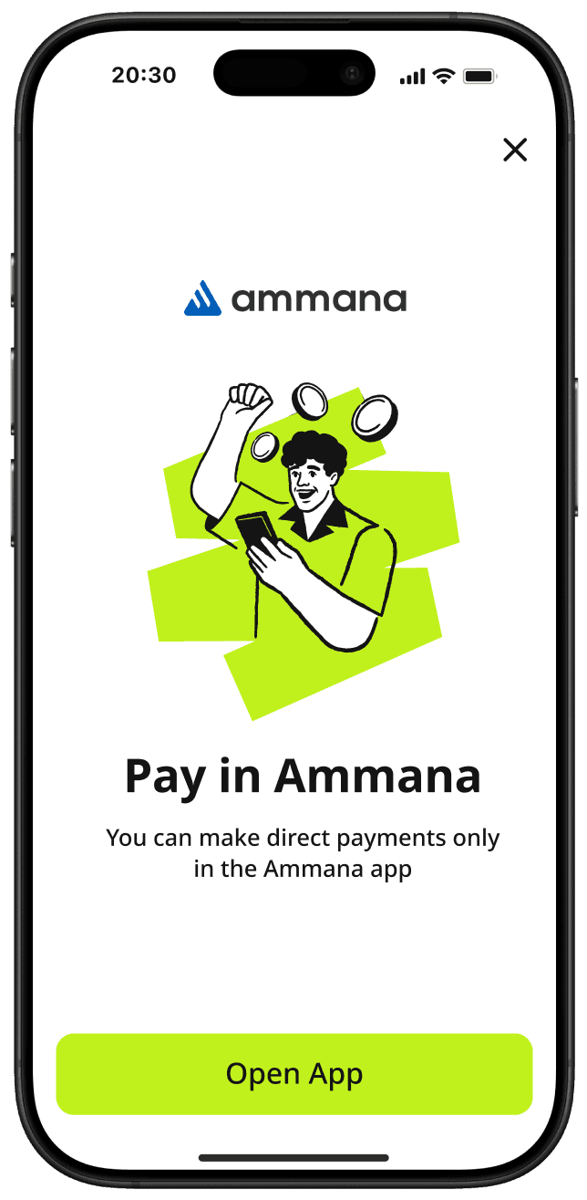
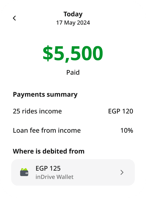
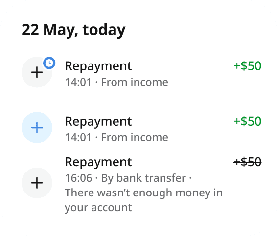
Top-up logic —
simplified and reusable
Top-up is one of the most fragmented flows in our product.
Depending on the country, users might pay directly from Wallet, through a third-party service, or in a partner app


Real launches. Real results


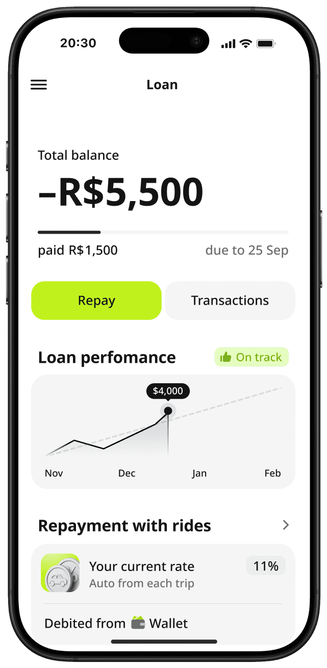
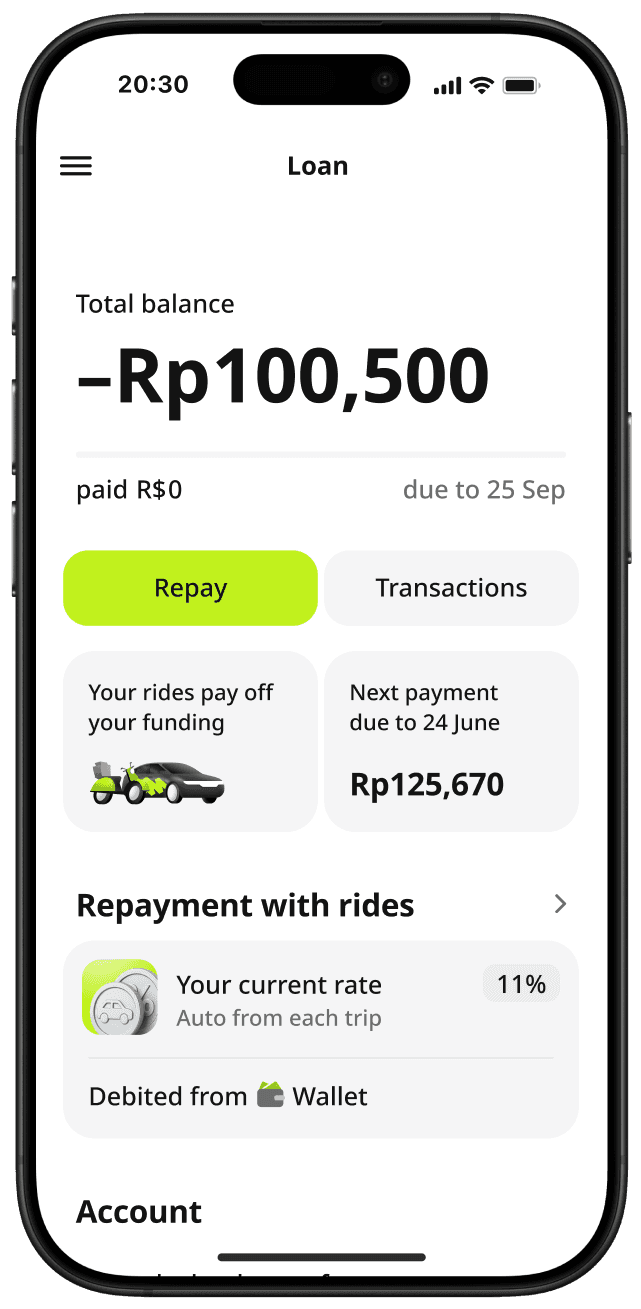
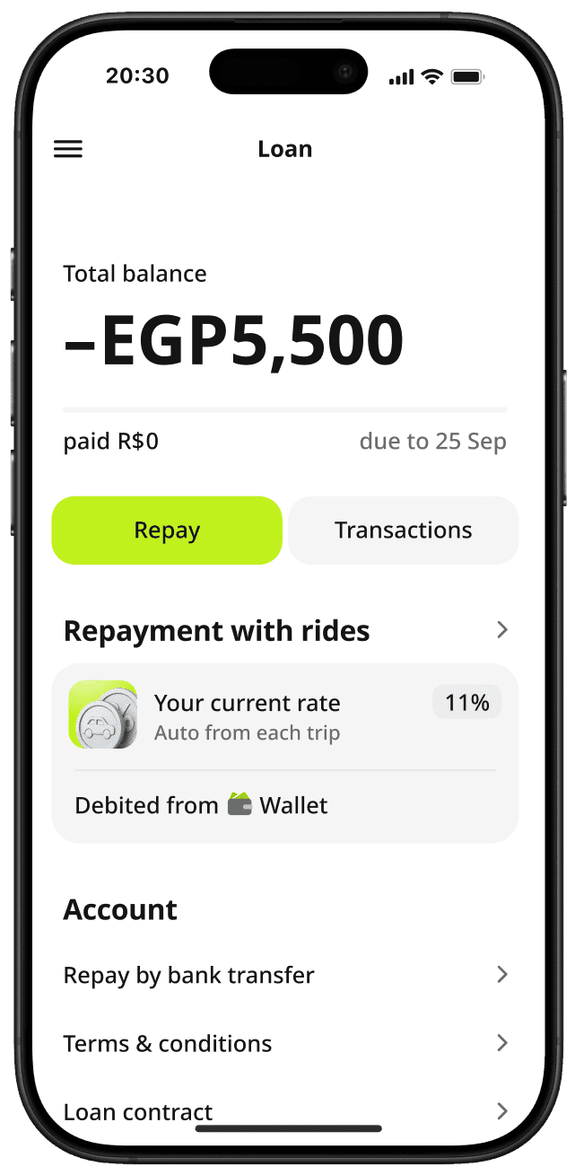
This page has already scaled to Brazil, Egypt, and Indonesia. The logic held up. The flows adapted. And the launches were smooth
/ Every screen, state, and action is designed, documented, and connected to real logic
I keep improving it as we launch in new countries, refine flows, and uncover edge cases.The work doesn’t stop — it evolves with the product

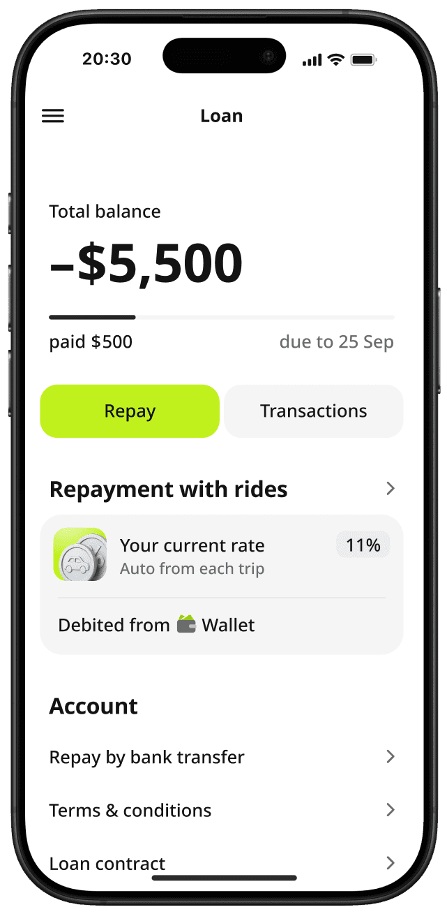
Main loan page for global rollout
A flexible main loan page built to work in any country, with local terms and currencies
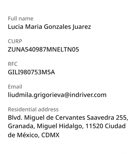
Project overview
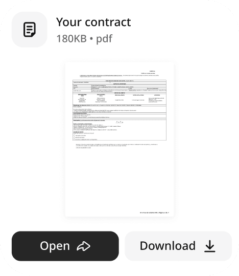
A simple, compliant onboarding flow for loan users in Mexico (CURP, RFC included)
What I worked on
I created a unified page, logic, and structure —
so we could launch faster without redesigning for each region
Project overview
A simple, compliant onboarding flow for loan users in Mexico (CURP, RFC included)
What I worked on
I created a unified page, logic, and structure — so we could launch faster without redesigning for each region
Main loan page for global rollout
A flexible main loan page built to work in any country, with local terms and currencies
The challenge
The loan experience was mostly the same across countries.
But in Figma — it wasn’t. Designs were scattered, flows weren’t connected, and there was no shared system
What I did
I brought everything into one page — with components, flows, and clear logic behind each block. Now every region starts from the same structure. Developers pick what they need, adapt the text, and launch faster — with full control and no guesswork
A single loan page with shared logic, reusable blocks, and clearly defined flows
(was the figma chaos)
and...
I decided to fix it
New version
/ Every state, screen, and variation is built as a component — connected to logic and user actions
Each flow is designed, documented, and ready to use
Ready to ship
/ Every top-up type is fully designed — from entry to confirmation.
/ Edge cases, button states, empty screens, success messages — all covered
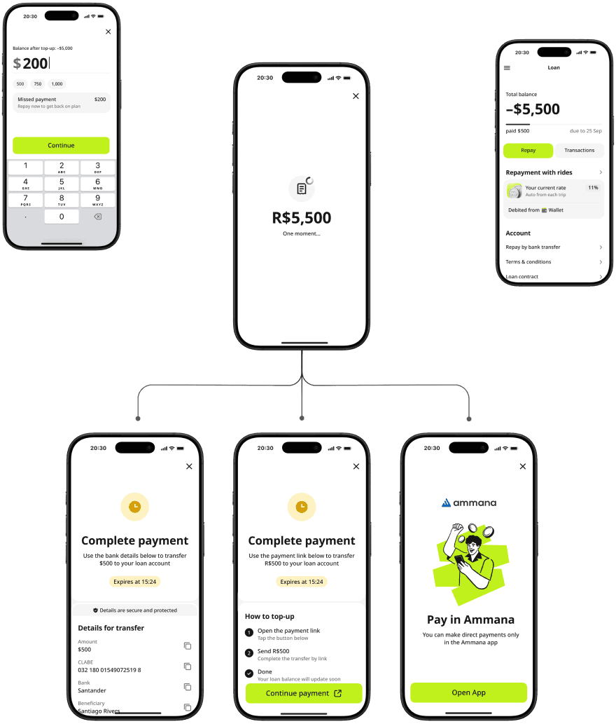
Teams just select the flow that fits
/ If something custom is needed, it’s clear what to change — and what to keep
Top-up logic —
simplified and reusable
Top-up is one of the most fragmented flows in our product. Depending on the country, users might pay directly from Wallet, through a third-party service, or in a partner app

Real launches. Real results
This page has already scaled to Brazil, Egypt, and Indonesia. The logic held up. The flows adapted. And the launches were smooth
/ Every screen, state, and action is designed, documented, and connected to real logic
I keep improving it as we launch in new countries, refine flows, and uncover edge cases.The work doesn’t stop — it evolves with the product